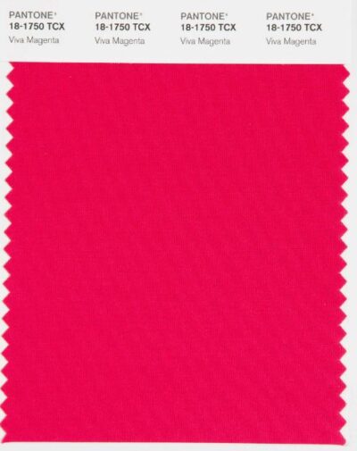
Pantone has announced it’s color of the year for 2023: Viva Magenta 18-1750. The color is said to be a new signal of strength, one that highlights a change of perspective influenced by the unconventionality and uncertainty of the past few years and how those years have resulted in a transformation of our lifestyles, how we view our sense of self, our priorities, and our identities.
According to Leattrice Eisman, the executive director at the Pantone Color Institute, “This color reconnects us to organic matter. Invoking the forces of nature…Viva magenta galvanizes our sprit, helping us to build our inner strength.”
The New York Times article headline reads, “Pantone’s Color of the Year was made for the Metaverse. Say Hello to Viva Magenta, the color no one asked for, coming to a world where no one lives.” The article goes on to say “The shade was selected by human trend prognosticators who survey fashion and design, then interpreted by the A.I. tool Midjourney to create what Pantone described as an “endless new ecosystem to be explored, called ‘the Magentaverse.’” In a news release, the company called Viva Magenta, a.k.a. Pantone 18-1750, “an unconventional shade for an unconventional time.”
It is indeed an unconventional time. A time when nothing seems to shock us much us anymore, including the fact that A.I. played a part in the creating the image for this color.
The video of the announcement on the Pantone site begins in black and white. A depiction of hopeless-looking people isolated in their homes, peering out their windows to the primordial sound of a heart beating. The heartbeat fades away and the sound of a sweeping wind takes over. Then a more upbeat music gives way to a brighter, lighter, and more energetic compilation of people of all walks of life leaving their homes–together again–smiling, laughing, dancing, bathed in hues of Viva Magenta.
The adjectives that Laurie Pressman (Vice President of the Pantone Color Institute) uses to describe Viva Magenta are numerous. Exuberant, electrifying, boundaryless, fearless, powerful, and empowering are just a few of the words used to describe this “animated red that encourages experimentation and self expression without restraint”.
Pressman says that Viva Magenta demonstrates a new signal of strength and that rather than going back to the status quo we can embrace the transformation that has taken place over the past few years and use this an an opportunity to write a new narrative for ourselves and establish new vison.
Pressman explains the color as a transformative red tone that makes a bold statement and is a balance between warm and cool. Viva Magenta descends from the red family and is inspired by the red of cochineal, a strong and bright dye belonging to the natural dye family.
She goes on to say that Viva Magenta is “A hybrid color that comfortably straddles the physical and virtual evocative of our multi-dimensional world.” She calls the color “audacious, witty, and inclusive of all“, and that it “welcomes everyone and anyone with the same rebellious spirit“. She calls it “assertive but not aggressive” and says that does not boldly dominate but instead takes a “fist in a velvet glove approach“, one that can “create a more positive future“.
Pressman says that Viva Magenta is rooted in the primordial and that it reconnects us to that original matter, evoking the forces of nature. It helps to galvanize our spirit, helping is to build inner strength.
In keeping in line the with the unconventionality of this color, Pantone took an unconventional approach to create the (creepy IMO) image to represent Viva Magenta that “explores the relationship and tensions that exist between new technology and human creativity” and “serves as an invitation into our vision of this new world”. Designed and fabricated with the help of A.I., the image represents an “immersive Magenta Universe that examines the connections between nature and technology “.
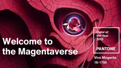
Photo by Pantone Color Institute
That is a lot of promise and hope packed into a color. Maybe it’s just what we need. Or is it?
It is no secret that color has an impact on our mood, our feelings and emotions. How you feel when you go outside on a gray day compared to a beautifully sunny day with blue sky overhead is obvious. Color influences our purchases as well. Think of the bright red, eye-catching clearance signs or how dark blue sends a signal of trust often seen in branding of banks and CPAs.
Whether you like Viva Magenta or not, one thing I think we can all agree on it that this color is anything but subtle.
There’s more…
Pantone has partnered with Motorola and Lenovo. Eisman tells us that “when we fuse color thoughtfully with our smart phones and our technologies, that technology is no longer just a tool, but it can become an extension of ourselves“. Pantone is working with Motorola and Lenovo on new way to expand the use of color in personal devices.
The new special addition of the Motorola Edge 30Fusion is available in Viva Magenta. Lenovo (the parent company of Motorola) has taken it a step further and partnered with ARTECHOUSE to develop an “immersive augmented reality experience” . The Lenovo Thinkrealty A3 smart glasses will allow you to virtually immerse yourself into the Magentaverse.
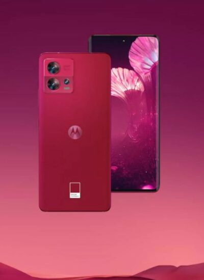
Photo by Motorola
This immersive lounge exhibition , as described by Tati Pastukhova, co-founder & executive director of ARTECHOUSE, brings the color to life, “utilizing technology and interdisciplinary design tools, we aimed to push the possibilities and truly submerge visitors into the elements and narratives of the color, unfolding the multiple layers and meanings through textures , sounds, gradients, and emotions that the color elicits. We sought inspiration in nature, the familiar experiences and visual language that would help us translate the message and manipulate it to create a digital world that exists at the borderline of virtual and real, synthetic and organic, human and machine.”
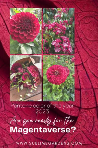
Of course, I had to delve in to my recent seed, bulb and tuber orders as well as photos of this past season’s flowers to see if I had anything that might represent this color.
I found the color to be very difficult to to to match since it is a red but many of the images online have more of a pink hue. Because of that I think there will be many variations of it, including my images below.
Here’s what I found:

Zinnia
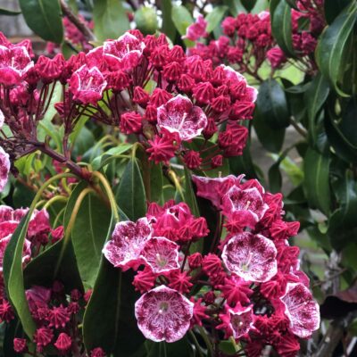
Kalmia

Dahlia Boom Boom Red

Viva Magentaesque mixed bouquet by Sublime Gardens
Whether Viva Magenta comes in to play in a big way in 2023 and beyond or not, I do think we are on trend for more bright and bold color in the future. The cut flower market has been riding the wave of the popular subtle colors of blush, apricot and peachy tones for quite some time now. Based on my own observance and the requests I was getting for jewel tones from florists this year, I think this trend will continue to expand into 2023 and further.
As for the Magentaverse… I think I’ll stay out in the garden and enjoy the colors of the real world.
So, tell me, how do you feel about the Magentaverse? I’d love to hear it in the comments!
Heidi
Leave A Comment